 admin
adminThe choice of color for high-visibility clothing is a matter of great importance; it is not merely about aesthetics, but rather a “safety language” grounded in science, standards, and industry conventions. Its primary objective is to ensure the wearer is as visible as possible in complex environments.
According to standards, high-visibility warning garments are permitted to use only the following three fluorescent colors:
Fluorescent Yellow: With a wavelength of approximately 550 nanometers, this is one of the colors to which the human eye is most sensitive in both daylight and low-light conditions, offering exceptional visibility.
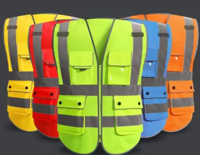
Fluorescent Orange-Red: Combining the high visibility of yellow with the warning properties of red, it offers 17% higher recognizability than standard orange, particularly in rainy or foggy weather or against gloomy backgrounds.
Fluorescent Red: Possessing the longest wavelength and strong visual impact, it is frequently used as a warning color for specific high-risk scenarios, such as firefighting.
The remarkable quality of these fluorescent materials lies in their ability to absorb ultraviolet light—invisible to the naked eye—and re-emit it as visible light. This is why high-visibility clothing appears to “glow” and stands out so strikingly on overcast days or at dusk.
In specific work environments, different colors also serve to indicate roles or identities. You can quickly understand these distinctions via the table below:
In short, the colors of high-visibility clothing create a “mobile safety barrier” for outdoor workers through a combination of scientific selection (high-brightness fluorescence), standardization (national standards), and industry-specific usage (role identification).
